Catalyst Magazine
My Role: Editorial Graphic Designer
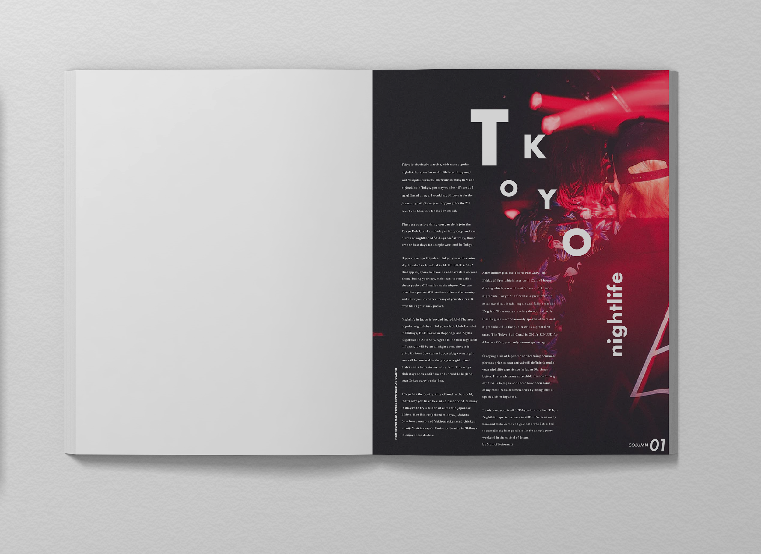
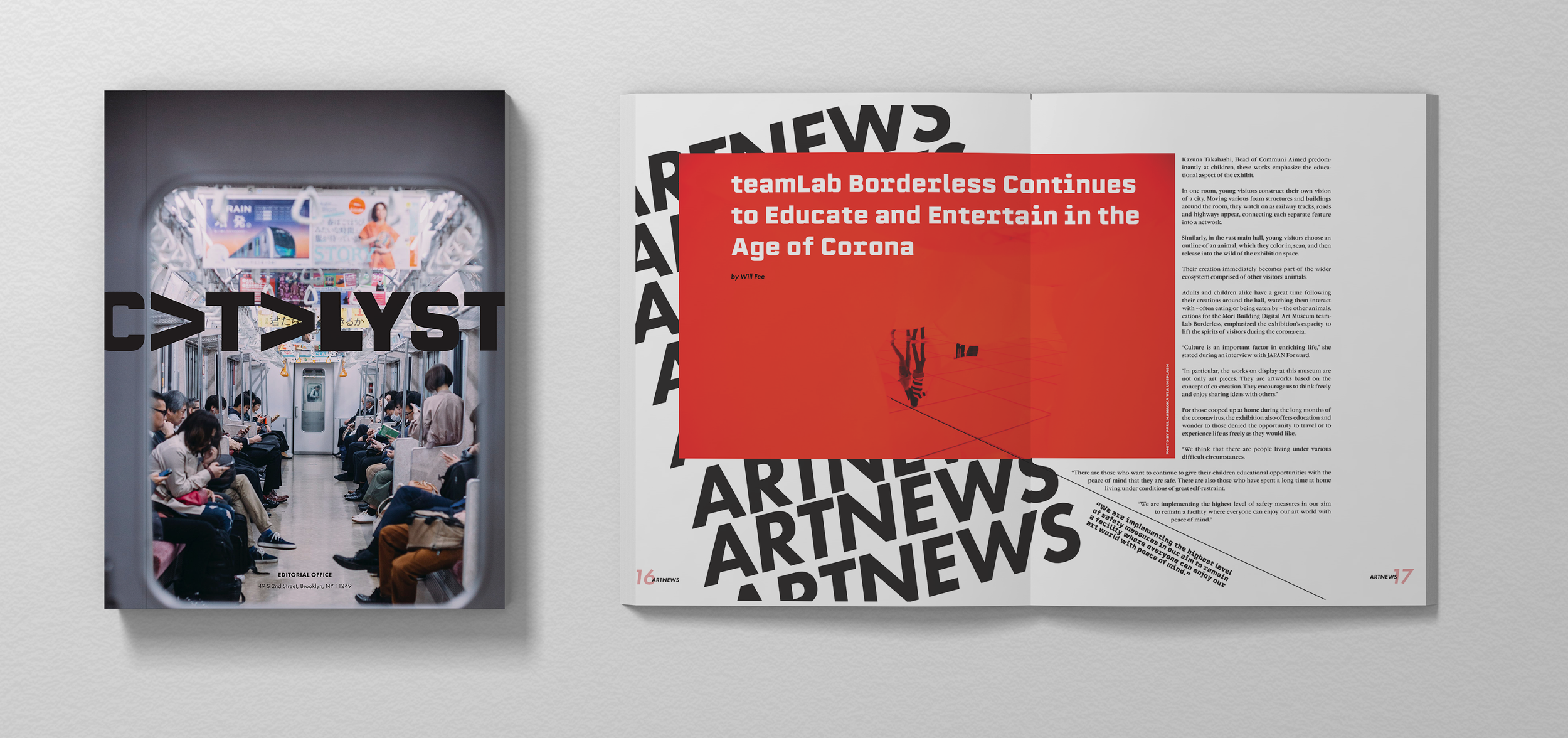
Inspired by my long-term fascination with learning about Japanese culture, I independently designed Catalyst, a conceptual editorial magazine that explored Japanese culture through politics, art, architecture, travel, and music. I used directional elements such as arrows and upside-down type to encourage reader interaction, mirroring the sometimes disorienting feeling of being in a bustling and visually overwhelming urban space.
Branding Design & Visual Strategy | Logo Design | Editorial Magazine Layout
My magazine won the Award for Art and was published in The Bridge Journal, Volume 19

I designed two cover variations, ultimately chose the cover on the left because of the unconventional vertical logo and compelling directionality in the photo.
I chose the name 'Catalyst' to imply change / movement and reflect culture's ability to be a dynamic force. I utilized an arrow to communicate the concept of cultural progression. Above are some of the concepts I explored.


